Temporal Empirical Dynamic Modeling
Last
update: 2026-03-30
Last run: 2026-03-30
Source: Last run: 2026-03-30
vignettes/tEDM.Rmd
tEDM.Rmd1. Introduction to the tEDM package
The tEDM package provides a suite of tools for exploring
and quantifying causality in time series using Empirical Dynamic
Modeling (EDM). It implements four fundamental EDM-based causal
discovery methods:
These methods enable researchers to:
Identify potential causal interactions without assuming a predefined model structure.
Distinguish between direct causation and indirect (mediated or confounded) influences.
Reconstruct underlying causal dynamics from replicated univariate time series observed across multiple spatial units.
2. Example data in the tEDM package
Hong Kong Air Pollution and Cardiovascular Admissions
A daily time series dataset(from 1995-3 to 1997-11) for Hong Kong that includes cardiovascular hospital admissions and major air pollutant concentrations.
File: cvd.csv
Columns:
| Column | Description |
|---|---|
cvd |
Daily number of cardiovascular-related hospital admissions. |
rsp |
Respirable suspended particulates (μg/m³). |
no2 |
Nitrogen dioxide concentration (μg/m³). |
so2 |
Sulfur dioxide concentration (μg/m³). |
o3 |
Ozone concentration (μg/m³). |
Source: Data adapted from PCM article.
US County-Level Carbon Emissions Dataset
A panel dataset covering U.S. county-level temperature and carbon emissions across time.
File: carbon.csv.gz
Columns:
| Column | Description |
|---|---|
year |
Observation year (1981–2017). |
fips |
County FIPS code (5-digit Federal Information Processing Standard code). |
tem |
Mean annual temperature (in Kelvin). |
carbon |
Total carbon emissions per year (in kilograms of CO₂). |
Source: Data adapted from FsATE article.
COVID-19 Infection Counts in Japan
A spatio-temporal dataset capturing the number of confirmed COVID-19 infections across Japan’s 47 prefectures over time.
File: covid.csv
Structure:
- Each column represents one of the 47 Japanese
prefectures (e.g.,
Tokyo,Osaka,Hokkaido). - Each row corresponds to a time step (daily).
Source: Data adapted from CMC article.
3. Case studies of the tEDM package
Install the stable version:
install.packages("tEDM", dep = TRUE)or developed version:
install.packages("tEDM",
                 repos = c("https://stscl.r-universe.dev",
                           "https://cloud.r-project.org"),
                 dep = TRUE)
Air Pollution and Cardiovascular Health in Hong Kong
Employing PCM to investigate the causal relationships between various air pollutants and cardiovascular diseases:
library(tEDM)

cvd = readr::read_csv(system.file("case/cvd.csv",package = "tEDM"))
## Rows: 1032 Columns: 5
## ── Column specification ──────────────────────────────────────────────────────────────────────
## Delimiter: ","
## dbl (5): cvd, rsp, no2, so2, o3
##
## ℹ Use `spec()` to retrieve the full column specification for this data.
## ℹ Specify the column types or set `show_col_types = FALSE` to quiet this message.
head(cvd)
## # A tibble: 6 × 5
##     cvd   rsp   no2   so2    o3
##   <dbl> <dbl> <dbl> <dbl> <dbl>
## 1   214  73.7  74.5  19.1 17.4
## 2   203  77.6  80.9  18.8 39.4
## 3   202  64.8  67.1  13.8 56.4
## 4   182  68.8  74.7  30.8  5.6
## 5   181  49.4  62.3  23.1  3.6
## 6   129  67.4  63.6  17.4  6.73
cvd_long = cvd |>
  tibble::rowid_to_column("id") |>
  tidyr::pivot_longer(cols = -id,
                      names_to = "variable", values_to = "value")

fig_cvds_ts = ggplot2::ggplot(cvd_long, ggplot2::aes(x = id, y = value, color = variable)) +
  ggplot2::geom_line(linewidth = 0.5) +
  ggplot2::labs(x = "Days (from 1995-3 to 1997-11)", y = "Concentrations or \nNO. of CVD admissions", color = "") +
  ggplot2::theme_bw() +
  ggplot2::theme(legend.direction = "horizontal",
                 legend.position = "inside",
                 legend.justification = c("center","top"),
                 legend.background = ggplot2::element_rect(fill = "transparent", color = NA))
fig_cvds_ts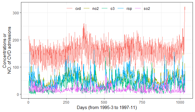
Determining optimal embedding dimension:
tEDM::fnn(cvd,"cvd",E = 2:50,eps = stats::sd(cvd$cvd))
##       E:1       E:2       E:3       E:4       E:5       E:6       E:7       E:8       E:9
## 0.8275862 0.4927374 0.3051882 0.2899288 0.2146490 0.2075280 0.1943032 0.1851475 0.1861648
##      E:10      E:11      E:12      E:13      E:14      E:15      E:16      E:17      E:18
## 0.1902340 0.1831129 0.1851475 0.1790437 0.1719227 0.1678535 0.1678535 0.1546287 0.1536114
##      E:19      E:20      E:21      E:22      E:23      E:24      E:25      E:26      E:27
## 0.1678535 0.1566633 0.1586979 0.1709054 0.1637843 0.1658189 0.1668362 0.1881994 0.1658189
##      E:28      E:29      E:30      E:31      E:32      E:33      E:34      E:35      E:36
## 0.1749746 0.1729400 0.1810783 0.1709054 0.1800610 0.1698881 0.1719227 0.1719227 0.1627670
##      E:37      E:38      E:39      E:40      E:41      E:42      E:43      E:44      E:45
## 0.1515768 0.1637843 0.1668362 0.1709054 0.1658189 0.1648016 0.1668362 0.1688708 0.1617497
##      E:46      E:47      E:48      E:49
## 0.1668362 0.1790437 0.1820956 0.1759919
Starting at \(E = 7\), the FNN ratio stabilizes near \(0.19\); thus, embedding dimension E and neighbor number k are chosen from \(7\) onward for subsequent self-prediction parameter selection.
tEDM::simplex(cvd,"cvd","cvd",E = 7:10,k = 8:12)
## The suggested E,k,tau for variable cvd is 7, 8 and 1
tEDM::simplex(cvd,"rsp","rsp",E = 7:10,k = 8:12)
## The suggested E,k,tau for variable rsp is 7, 8 and 1
tEDM::simplex(cvd,"no2","no2",E = 7:10,k = 8:12)
## The suggested E,k,tau for variable no2 is 7, 8 and 1
tEDM::simplex(cvd,"so2","so2",E = 7:10,k = 8:12)
## The suggested E,k,tau for variable so2 is 7, 11 and 1
tEDM::simplex(cvd,"o3","o3",E = 7:10,k = 8:12)
## The suggested E,k,tau for variable o3 is 7, 8 and 1

s1 = tEDM::simplex(cvd,"cvd","cvd",E = 7,k = 8:12)
s2 = tEDM::simplex(cvd,"rsp","rsp",E = 7,k = 8:12)
s3 = tEDM::simplex(cvd,"no2","no2",E = 7,k = 8:12)
s4 = tEDM::simplex(cvd,"so2","so2",E = 7,k = 8:12)
s5 = tEDM::simplex(cvd,"o3","o3",E = 7,k = 8:12)

list(s1,s2,s3,s4,s5)
## [[1]]
## The suggested E,k,tau for variable cvd is 7, 8 and 1
##
## [[2]]
## The suggested E,k,tau for variable rsp is 7, 9 and 1
##
## [[3]]
## The suggested E,k,tau for variable no2 is 7, 8 and 1
##
## [[4]]
## The suggested E,k,tau for variable so2 is 7, 11 and 1
##
## [[5]]
## The suggested E,k,tau for variable o3 is 7, 8 and 1

simplex_df = purrr::map2_dfr(list(s1,s2,s3,s4,s5),
                             c("cvd","rsp","no2","so2","o3"),
                             \(.list,.name) dplyr::mutate(.list$xmap,variable = .name))
ggplot2::ggplot(data = simplex_df) +
  ggplot2::geom_line(ggplot2::aes(x = k, y = rho, color = variable))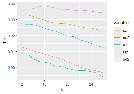
To investigate the causal influences of air pollutants on the incidence of cardiovascular diseases, we performed PCM analysis using an embedding dimension of \(7\) and number of nearest neighbors of \(8\) per variable pair.
vars = c("cvd", "rsp", "no2", "so2", "o3")
res = list()
var_pairs = combn(vars, 2, simplify = FALSE)

for (pair in var_pairs) {
  var1 = pair[1]
  var2 = pair[2]
  conds = setdiff(vars, pair)
  key = paste0(var1, "_", var2)
  res[[key]] = tEDM::pcm(data = cvd,
                         cause = var2,
                         effect = var1,
                         conds = conds,
                         E = 7, k = 8,
                         progress = FALSE)
}
The PCM results are shown in the figure below:
.process_xmap_result = \(g,type = c("xmap","pxmap")){
  type = match.arg(type)
  tempdf = g[[type]]
  tempdf$x = g$varname[1]
  tempdf$y = g$varname[2]
  tempdf = tempdf |>
    dplyr::select(1, x, y,
                  x_xmap_y_mean,x_xmap_y_sig,
                  y_xmap_x_mean,y_xmap_x_sig,
                  dplyr::everything()) |>
    dplyr::slice_tail(n = 1)

  g1 = tempdf |>
    dplyr::select(x,y,y_xmap_x_mean,y_xmap_x_sig)|>
    purrr::set_names(c("cause","effect","cs","sig"))
  g2 = tempdf |>
    dplyr::select(y,x,x_xmap_y_mean,x_xmap_y_sig) |>
    purrr::set_names(c("cause","effect","cs","sig"))

  return(rbind(g1,g2))
}

plot_cs_matrix = \(.tbf,legend_title = expression(rho)){
  .tbf = .tbf |>
    dplyr::mutate(sig_marker = dplyr::case_when(
      sig > 0.05 ~ sprintf("paste(%.4f^'#')", cs),
      TRUE ~ sprintf('%.4f', cs)
    ))

  fig = ggplot2::ggplot(data = .tbf,
                        ggplot2::aes(x = effect, y = cause)) +
    ggplot2::geom_tile(color = "black", ggplot2::aes(fill = cs)) +
    ggplot2::geom_abline(slope = 1, intercept = 0,
                         color = "black", linewidth = 0.25) +
    ggplot2::geom_text(ggplot2::aes(label = sig_marker), parse = TRUE,
                       color = "black", family = "serif") +
    ggplot2::labs(x = "Effect", y = "Cause", fill = legend_title) +
    ggplot2::scale_x_discrete(expand = c(0, 0)) +
    ggplot2::scale_y_discrete(expand = c(0, 0)) +
    ggplot2::scale_fill_gradient(low = "#9bbbb8", high = "#256c68") +
    ggplot2::coord_equal() +
    ggplot2::theme_void() +
    ggplot2::theme(
      axis.text.x = ggplot2::element_text(angle = 0, family = "serif"),
      axis.text.y = ggplot2::element_text(color = "black", family = "serif"),
      axis.title.y = ggplot2::element_text(angle = 90, family = "serif"),
      axis.title.x = ggplot2::element_text(color = "black", family = "serif",
                                           margin = ggplot2::margin(t = 5.5, unit = "pt")),
      legend.text = ggplot2::element_text(family = "serif"),
      legend.title = ggplot2::element_text(family = "serif"),
      legend.background = ggplot2::element_rect(fill = NA, color = NA),
      #legend.direction = "horizontal",
      #legend.position = "bottom",
      legend.margin = ggplot2::margin(t = 1, r = 0, b = 0, l = 0, unit = "pt"),
      legend.key.width = ggplot2::unit(20, "pt"),
      panel.grid = ggplot2::element_blank(),
      panel.border = ggplot2::element_rect(color = "black", fill = NA)
    )
  return(fig)
}

pcm_df = purrr::map_dfr(res,\(.list) .process_xmap_result(.list,type = "pxmap"))
fig_pcs = plot_cs_matrix(pcm_df)
fig_pcs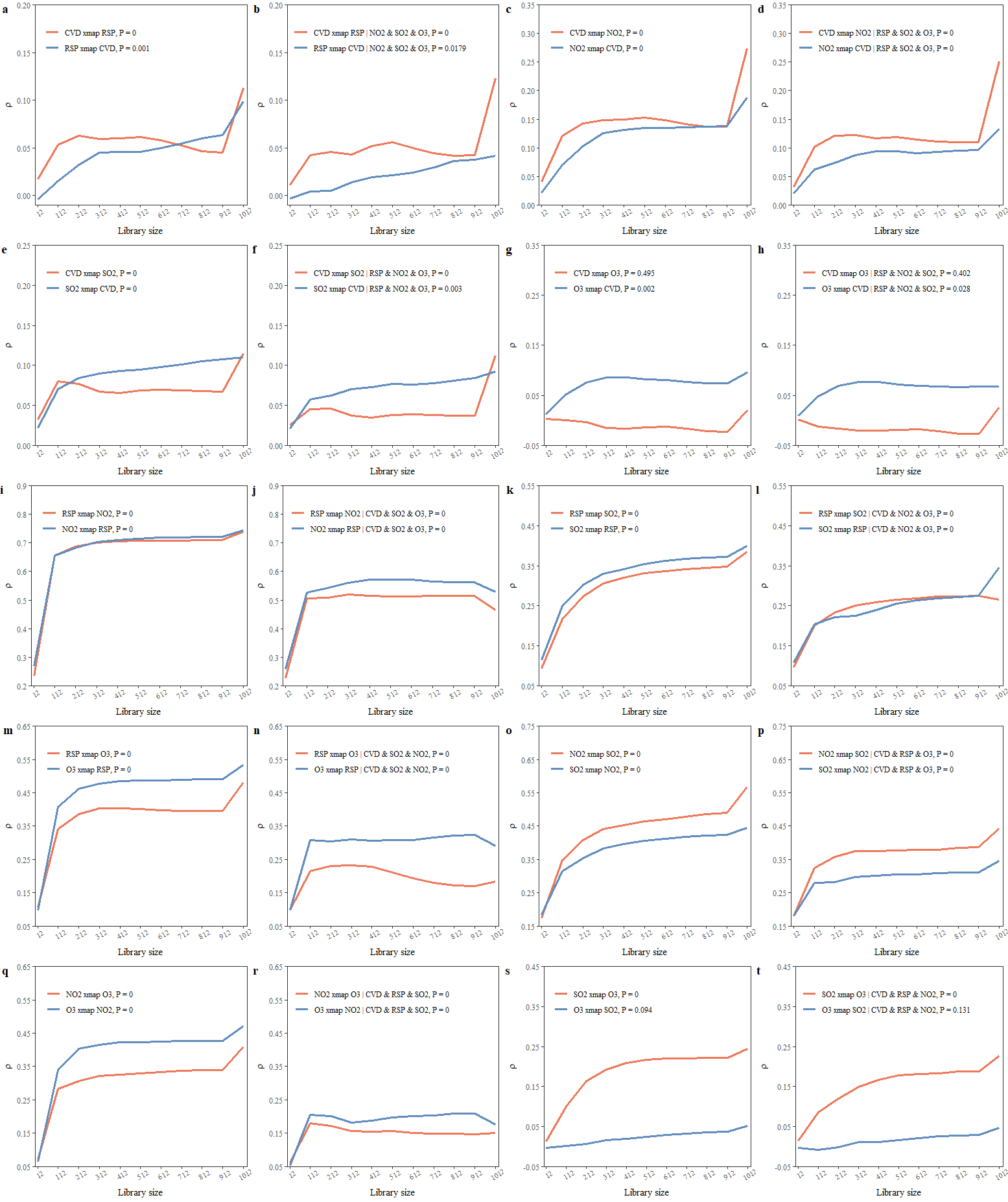
From Figure 3, we can infer the following causal links:
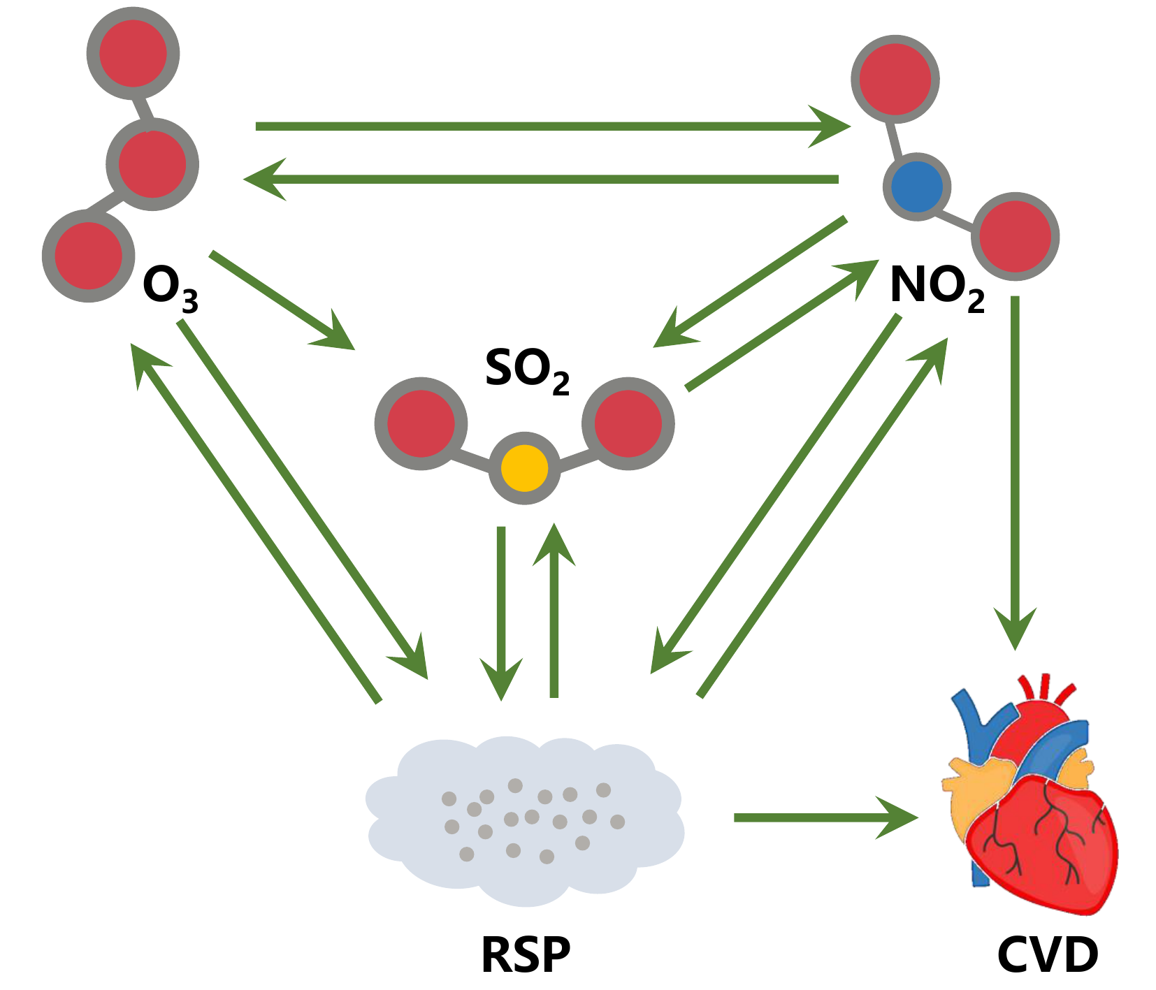
Figure 4. Causal interactions between air pollutants and cardiovascular diseases in Hong Kong.
US County Carbon Emissions and Temperature Dynamics
To examine whether a causal relationship exists between annual mean temperature and total annual CO₂ emissions, we implement the CMC method across counties.
library(tEDM)

carbon = readr::read_csv(system.file("case/carbon.csv.gz",package = "tEDM"))
## Rows: 113627 Columns: 4
## ── Column specification ──────────────────────────────────────────────────────────────────────
## Delimiter: ","
## dbl (4): year, fips, tem, carbon
##
## ℹ Use `spec()` to retrieve the full column specification for this data.
## ℹ Specify the column types or set `show_col_types = FALSE` to quiet this message.
head(carbon)
## # A tibble: 6 × 4
##    year  fips   tem     carbon
##   <dbl> <dbl> <dbl>      <dbl>
## 1  1981  1001  17.4 192607687.
## 2  1982  1001  18.4 187149414.
## 3  1983  1001  16.9 191584445.
## 4  1984  1001  17.8 199157579.
## 5  1985  1001  17.9 205207564.
## 6  1986  1001  18.5 218446030.

carbon_list = dplyr::group_split(carbon, by = fips)
length(carbon_list)
## [1] 3071
Using the 100th county as an example, we determine the appropriate embedding dimension by applying the FNN method.
tEDM::fnn(carbon_list[[100]],"carbon",E = 2:10,eps = stats::sd(carbon_list[[100]]$carbon))
##        E:1        E:2        E:3        E:4        E:5        E:6        E:7        E:8
## 0.35714286 0.03571429 0.00000000 0.00000000 0.00000000 0.00000000 0.00000000 0.00000000
##        E:9
## 0.00000000
When E equals \(3\), the FNN ratio begins to drop to zero; therefore, we select \(E = 3\) as the embedding dimension for the CMC analysis.
res = carbon_list |>
  purrr::map_dfr(\(.x) {
    g = tEDM::cmc(.x,"tem","carbon",E = 3,k = 18,dist.metric = "L2",progressbar = FALSE)
    return(g$xmap)
  })
head(res)
##   neighbors x_xmap_y_mean x_xmap_y_sig x_xmap_y_lower x_xmap_y_upper y_xmap_x_mean
## 1        18     0.2669753 0.0083829567     0.09372879      0.4402218    0.09104938
## 2        18     0.2314815 0.0012106678     0.06886439      0.3940986    0.08796296
## 3        18     0.2021605 0.0001563996     0.04775587      0.3565651    0.08024691
## 4        18     0.2947531 0.0276001573     0.11214275      0.4773634    0.08487654
## 5        18     0.2824074 0.0180642479     0.10202679      0.4627880    0.09413580
## 6        18     0.2098765 0.0002847089     0.05317822      0.3665749    0.08024691
##   y_xmap_x_sig y_xmap_x_lower y_xmap_x_upper
## 1 1.175387e-14              0      0.1948920
## 2 1.186317e-16              0      0.1854438
## 3 1.217722e-17              0      0.1764553
## 4 5.431816e-17              0      0.1820035
## 5 1.725075e-14              0      0.1978540
## 6 1.217722e-17              0      0.1764553

res_carbon = res |>
  dplyr::select(neighbors,
                carbon_tem = x_xmap_y_mean,
                tem_carbon = y_xmap_x_mean) |>
  tidyr::pivot_longer(c(carbon_tem, tem_carbon),
                      names_to = "variable", values_to = "value")
head(res_carbon)
## # A tibble: 6 × 3
##   neighbors variable    value
##       <dbl> <chr>       <dbl>
## 1        18 carbon_tem 0.267
## 2        18 tem_carbon 0.0910
## 3        18 carbon_tem 0.231
## 4        18 tem_carbon 0.0880
## 5        18 carbon_tem 0.202
## 6        18 tem_carbon 0.0802
res_carbon$variable = factor(res_carbon$variable,
                             levels = c("carbon_tem", "tem_carbon"),
                             labels = c("carbon → tem", "tem → carbon"))
fig_case2 = ggplot2::ggplot(res_carbon,
                            ggplot2::aes(x = variable, y = value, fill = variable)) +
  ggplot2::geom_boxplot() +
  ggplot2::geom_hline(yintercept = 0.2, linetype = "dashed", color = "red", linewidth = 0.8) +
  ggplot2::theme_bw() +
  ggplot2::scale_x_discrete(name = "") +
  ggplot2::scale_y_continuous(name = "Causal Strength",
                              expand = c(0,0),
                              limits = c(0,0.45),
                              breaks = seq(0,0.45,by = 0.05)) +
  ggplot2::theme(legend.position = "none",
                 axis.text.x = ggplot2::element_text(size = 12),
                 axis.text.y = ggplot2::element_text(size = 12),
                 axis.title.y = ggplot2::element_text(size = 12.5))
fig_case2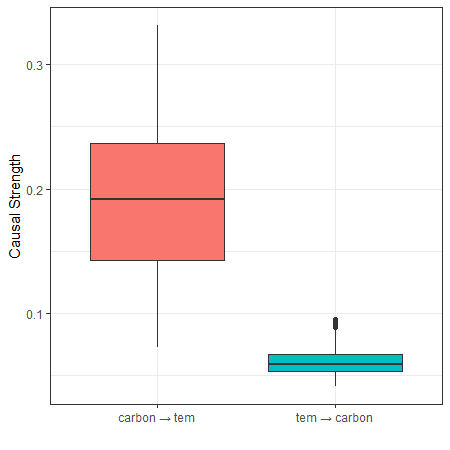
COVID-19 Spread Across Japanese Prefectures
We examine the COVID-19 transmission between Tokyo and other prefectures by applying CCM to identify the underlying causal dynamics of the epidemic spread
library(tEDM)

covid = readr::read_csv(system.file("case/covid.csv",package = "tEDM"))
## Rows: 334 Columns: 47
## ── Column specification ──────────────────────────────────────────────────────────────────────
## Delimiter: ","
## dbl (47): Hokkaido, Aomori, Iwate, Miyagi, Akita, Yamagata, Fukushima, Ibaraki, Tochigi, G...
##
## ℹ Use `spec()` to retrieve the full column specification for this data.
## ℹ Specify the column types or set `show_col_types = FALSE` to quiet this message.
head(covid)
## # A tibble: 6 × 47
##   Hokkaido Aomori Iwate Miyagi Akita Yamagata Fukushima Ibaraki Tochigi Gunma Saitama Chiba
##      <dbl>  <dbl> <dbl>  <dbl> <dbl>    <dbl>     <dbl>   <dbl>   <dbl> <dbl>   <dbl> <dbl>
## 1        0      0     0      0     0        0         0       0       0     0       0     0
## 2        0      0     0      0     0        0         0       0       0     0       0     0
## 3        0      0     0      0     0        0         0       0       0     0       0     0
## 4        0      0     0      0     0        0         0       0       0     0       0     0
## 5        0      0     0      0     0        0         0       0       0     0       0     0
## 6        0      0     0      0     0        0         0       0       0     0       0     0
## # ℹ 35 more variables: Tokyo <dbl>, Kanagawa <dbl>, Niigata <dbl>, Toyama <dbl>,
## #   Ishikawa <dbl>, Fukui <dbl>, Yamanashi <dbl>, Nagano <dbl>, Gifu <dbl>, Shizuoka <dbl>,
## #   Aichi <dbl>, Mie <dbl>, Shiga <dbl>, Kyoto <dbl>, Osaka <dbl>, Hyogo <dbl>, Nara <dbl>,
## #   Wakayama <dbl>, Tottori <dbl>, Shimane <dbl>, Okayama <dbl>, Hiroshima <dbl>,
## #   Yamaguchi <dbl>, Tokushima <dbl>, Kagawa <dbl>, Ehime <dbl>, Kochi <dbl>, Fukuoka <dbl>,
## #   Saga <dbl>, Nagasaki <dbl>, Kumamoto <dbl>, Oita <dbl>, Miyazaki <dbl>, Kagoshima <dbl>,
## #   Okinawa <dbl>
The data are first differenced:
covid = covid |>
  dplyr::mutate(dplyr::across(dplyr::everything(),
                              \(.x) c(NA,diff(.x)))) |>
  dplyr::filter(dplyr::if_all(dplyr::everything(),
                \(.x) !is.na(.x)))
Using Tokyo’s COVID-19 infection data to test the optimal embedding dimension.
tEDM::fnn(covid,"Tokyo",E = 2:30,eps = stats::sd(covid$Tokyo))
##        E:1        E:2        E:3        E:4        E:5        E:6        E:7        E:8
## 0.79452055 0.20070423 0.09459459 0.06666667 0.05629139 0.03947368 0.04605263 0.05263158
##        E:9       E:10       E:11       E:12       E:13       E:14       E:15       E:16
## 0.05263158 0.02960526 0.02960526 0.03947368 0.02302632 0.02631579 0.02302632 0.02960526
##       E:17       E:18       E:19       E:20       E:21       E:22       E:23       E:24
## 0.03618421 0.04605263 0.05263158 0.05263158 0.05592105 0.03947368 0.03289474 0.02960526
##       E:25       E:26       E:27       E:28       E:29
## 0.02960526 0.02631579 0.03289474 0.04276316 0.04605263
Since the FNN ratio begins to approach \(0.0296\) when E equals \(10\), embedding dimensions from \(10\) onward are evaluated, and the pair of E and k yielding the highest self-prediction accuracy is selected for the CCM procedure.
tEDM::simplex(covid,"Tokyo","Tokyo",E = 10:20,k = 11:25)
## The suggested E,k,tau for variable Tokyo is 10, 12 and 1
res = names(covid)[-match("Tokyo",names(covid))] |>
  purrr::map_dfr(\(.l) {
    g = tEDM::ccm(covid,"Tokyo",.l,E = 10,k = 12,progressbar = FALSE)
    res = dplyr::mutate(g$xmap,x = "Tokyo",y = .l)
    return(res)
  })
head(res)
##   libsizes x_xmap_y_mean x_xmap_y_sig x_xmap_y_lower x_xmap_y_upper y_xmap_x_mean
## 1      324     0.7084551 0.0000000000     0.64964305      0.7588380     0.7689897
## 2      324     0.2046948 0.0002075707     0.09791848      0.3068120     0.4997165
## 3      324     0.5757997 0.0000000000     0.49808921      0.6443348     0.7884318
## 4      324     0.5691621 0.0000000000     0.49062873      0.6385236     0.7971954
## 5      324     0.1639373 0.0030812353     0.05597701      0.2681084     0.4385033
## 6      324     0.7136233 0.0000000000     0.65564363      0.7632368     0.5300848
##   y_xmap_x_sig y_xmap_x_lower y_xmap_x_upper     x        y
## 1            0      0.7203905      0.8100744 Tokyo Hokkaido
## 2            0      0.4132578      0.5772461 Tokyo   Aomori
## 3            0      0.7433293      0.8263980 Tokyo    Iwate
## 4            0      0.7537038      0.8337352 Tokyo   Miyagi
## 5            0      0.3460785      0.5224988 Tokyo    Akita
## 6            0      0.4469389      0.6041504 Tokyo Yamagata

df1 = res |>
    dplyr::select(x,y,y_xmap_x_mean,y_xmap_x_sig)|>
    purrr::set_names(c("cause","effect","cs","sig"))
df2 = res |>
    dplyr::select(y,x,x_xmap_y_mean,x_xmap_y_sig) |>
    purrr::set_names(c("cause","effect","cs","sig"))
res_covid = dplyr::bind_rows(df1,df2)|>
  dplyr::filter(cause == "Tokyo") |>
  dplyr::arrange(dplyr::desc(cs))
head(res_covid,10)
##    cause   effect        cs sig
## 1  Tokyo Kanagawa 0.9358728   0
## 2  Tokyo    Osaka 0.9350703   0
## 3  Tokyo    Chiba 0.9289090   0
## 4  Tokyo  Saitama 0.9265648   0
## 5  Tokyo     Nara 0.9200096   0
## 6  Tokyo    Aichi 0.9156088   0
## 7  Tokyo    Hyogo 0.9043978   0
## 8  Tokyo Shizuoka 0.8949104   0
## 9  Tokyo  Ibaraki 0.8940835   0
## 10 Tokyo     Gifu 0.8773113   0
Using 0.90 as the threshold (rounded to two decimal
places), we map the causal responses in the spread of COVID-19 from
Tokyo for those with a causal strength greater than
0.90.
res_covid = res_covid |>
  dplyr::mutate(cs = round(res_covid$cs,2)) |>
  dplyr::filter(cs >= 0.90)
res_covid
##   cause   effect   cs sig
## 1 Tokyo Kanagawa 0.94   0
## 2 Tokyo    Osaka 0.94   0
## 3 Tokyo    Chiba 0.93   0
## 4 Tokyo  Saitama 0.93   0
## 5 Tokyo     Nara 0.92   0
## 6 Tokyo    Aichi 0.92   0
## 7 Tokyo    Hyogo 0.90   0

if (!requireNamespace("rnaturalearth")) {
  install.packages("rnaturalearth")
}
## Loading required namespace: rnaturalearth
jp = rnaturalearth::ne_states(country = "Japan")

if (!requireNamespace("tidygeocoder")) {
  install.packages("tidygeocoder")
}
## Loading required namespace: tidygeocoder
jpp = tibble::tibble(name = c("Tokyo",res_covid$effect)) |>
  dplyr::mutate(type = factor(c("source",rep("target",7)),
                              levels = c("source","target"))) |>
  tidygeocoder::geocode(state = name, method = "arcgis",
                        long = "lon", lat = "lat")
## Passing 8 addresses to the ArcGIS single address geocoder
## Query completed in: 7.9 seconds

fig_case3 = ggplot2::ggplot() +
  ggplot2::geom_sf(data = jp, fill = "#ffe7b7", color = "grey", linewidth = 0.45) +
  ggplot2::geom_curve(data = jpp[-1,],
                      ggplot2::aes(x = jpp[1,"lon",drop = TRUE],
                                   y = jpp[1,"lat",drop = TRUE],
                                   xend = lon, yend = lat),
                      curvature = 0.2,
                      arrow = ggplot2::arrow(length = ggplot2::unit(0.2, "cm")),
                      color = "#6eab47", linewidth = 1) +
  ggplot2::geom_point(data = jpp,
                      ggplot2::aes(x = lon, y = lat, color = type),
                      size = 1.25, show.legend = FALSE) +
  ggrepel::geom_text_repel(data = jpp,
                           ggplot2::aes(label = name, x = lon, y = lat, color = type),
                           show.legend = FALSE) +
  ggplot2::scale_color_manual(values = c(source = "#2c74b7",
                                         target = "#cf574b")) +
  ggplot2::coord_sf(xlim = range(jpp$lon) + c(-0.45,0.45),
                    ylim = range(jpp$lat) + c(-0.75,0.75)) +
  ggplot2::labs(x = "", y = "") +
  ggplot2::theme_bw() +
  ggplot2::theme(panel.background = ggplot2::element_rect(fill = "#9cd1fd", color = NA),
                 plot.margin = ggplot2::margin(0, 0, 0, 0, unit = "cm"))

fig_case3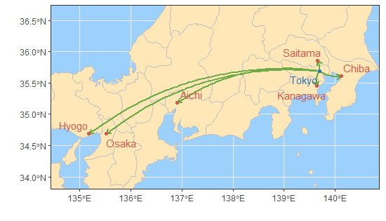
Reference
Sugihara, G., May, R., Ye, H., Hsieh, C., Deyle, E., Fogarty, M., Munch, S., 2012. Detecting Causality in Complex Ecosystems. Science 338, 496–500. https://doi.org/10.1126/science.1227079.
Leng, S., Ma, H., Kurths, J., Lai, Y.-C., Lin, W., Aihara, K., Chen, L., 2020. Partial cross mapping eliminates indirect causal influences. Nature Communications 11. https://doi.org/10.1038/s41467-020-16238-0.
Tao, P., Wang, Q., Shi, J., Hao, X., Liu, X., Min, B., Zhang, Y., Li, C., Cui, H., Chen, L., 2023. Detecting dynamical causality by intersection cardinal concavity. Fundamental Research. https://doi.org/10.1016/j.fmre.2023.01.007.
Clark, A.T., Ye, H., Isbell, F., Deyle, E.R., Cowles, J., Tilman, G.D., Sugihara, G., 2015. Spatial convergent cross mapping to detect causal relationships from short time series. Ecology 96, 1174–1181. https://doi.org/10.1890/14-1479.1.
Gan, T., Succar, R., Macrì, S., Marín, M.R., Porfiri, M., 2025. Causal discovery from city data, where urban scaling meets information theory. Cities 162, 105980. https://doi.org/10.1016/j.cities.2025.105980.
Lyu, W., Lei, Y., Yi, W., Song, Y., Li, X., Dai, S., Qin, Y., Zhao, W., 2026. Causal discovery in urban data with temporal empirical dynamic modeling: The R package tEDM. Computers, Environment and Urban Systems 127, 102435. https://doi.org/10.1016/j.compenvurbsys.2026.102435.